atlanta graphic design

Color Scheme's You Can Steal

Color Scheme's You Can Steal

Starting a business and can’t decide on a color palette? We are here to help! Color carries across your vision, message, and vibe and it has the ability to make or break your branding. We are here to show you a few color schemes that feel refreshing and new, but still timeless and classic.

Color Temperature Explained

Color Temperature Explained

Although most light bulbs in your home look white, did you know light actually comes in a few different colors. Learn more about about color temperature today!

   Adobe Premiere vs Final Cut Pro

   Adobe Premiere vs Final Cut Pro

Adobe Premiere and Final Cut Pro are the two leading digital editing platforms in the consumer market. Learn which one is the right fit for you today! 

The Importance of Color in Branding

The Importance of Color in Branding

In 2018’s competitive market and an especially competitive digital/social landscape, the proper branding is essential.

A 3 Step Design Process

A 3 Step Design Process

Discover three main steps that many designers (including our Atlanta based Graphic Designer) follow in order to ensure a streamlined experience.

The Burnette Agency Gift Guide: Valentine's Day

The Burnette Agency Gift Guide: Valentine's Day

Valentine’s day is here! If you have forgotten, or pushed your gift-buying to the very last minute, do not fret. We have put together our 2017 gift guide to help even the most clueless of gift givers! 

Photoshop vs Lightroom

Photoshop vs Lightroom

If you are new to photography or are simply doing research to find out what editing programs to buy, there are several things to take into consideration when going to purchase them. Learn the basics about Adobe Creative Suites through our Atlanta-based photographer. 

Art vs. Design

Art vs. Design

Art and design. What’s the difference? Learn from our photographer how these components are more different than you think, and how you can use these elements in your social media and public relations. 

What’s the Difference Between a Typeface and a Font?

When I took my first typography class in college, I had no idea that there was a difference between a typeface and a font. Turns out, many people don’t know there is a difference. But it’s actually quite interesting, and is an essential piece of knowledge for a designer.

Here’s the basic idea:

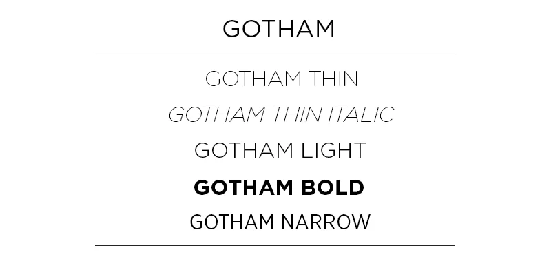
A typeface is a family of fonts – let’s use Gotham for example. Within the family of Gotham lies its fonts distinguished by weight and style, such as Gotham Book, Gotham Light, Gotham Thin Italic, Gotham Narrow Light, etc. In traditional print times, the classification of a font also depended on its point size, since printing presses had to buy type plates. Now, the term font doesn’t necessarily include point size.

Gotham

Let’s break it down:

Typeface: Gotham

Font: Gotham Narrow Light 

Typeface: Chronicle Display

Font: Chronicle Display Light Italic

Today, many people use the terms typeface and font synonymously, but as a designer, knowing the difference is a huge help. For brands, it can be important to signify a specific font as representative of your brand instead of an entire typeface. For example, depending on the company, it may not be on-brand to use both a thin and a black font within a typeface. If you’re working with a designer, it will help them in creating on-brand material if you make this distinction!