It’s a new decade and you might be looking to upgrade your branding and logo design. As a business owner, you probably invest a lot of time and money into your property and equipment and the same should go for your logo.
Color Of The Year 2020: Meet Classic Blue
The Ultimate Breakdown Of File Types
Have you ever received a file from your designer and were unable to open it? There is a good chance that the file type required a special software program in order to open it. I am going to breakdown a few common file types that you might come across while working with a designer and what they stand for and how to use them.
Color Scheme's You Can Steal
Create Aesthetic Instagram Pictures with Lightroom Presets!
Live Streaming Dominates the Social Media World
The Importance of Color in Branding
A 3 Step Design Process
Why You Need to Hire a Professional Designer
The Client, Designer, and Revisions
How To Manage Multiple Design Projects
3 Simple Ways to Improve Your Website
A website is a vital part of any business, and a well designed website has become essential in now-saturated business markets. As professionals in social media and public relations, we know a thing or two about growing a business online. Learn how your business can improve its website with our three tips!
Photoshop vs Lightroom
How to Find Design Inspiration
Art vs. Design
We Love Pantone’s 2017 Color of the Year (And You Will Too!)
Resources to Elevate Your Design
What’s the Difference Between a Typeface and a Font?
When I took my first typography class in college, I had no idea that there was a difference between a typeface and a font. Turns out, many people don’t know there is a difference. But it’s actually quite interesting, and is an essential piece of knowledge for a designer.
Here’s the basic idea:
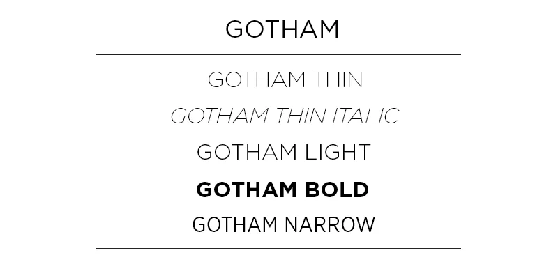
A typeface is a family of fonts – let’s use Gotham for example. Within the family of Gotham lies its fonts distinguished by weight and style, such as Gotham Book, Gotham Light, Gotham Thin Italic, Gotham Narrow Light, etc. In traditional print times, the classification of a font also depended on its point size, since printing presses had to buy type plates. Now, the term font doesn’t necessarily include point size.
Let’s break it down:
Typeface: Gotham
Font: Gotham Narrow Light
Typeface: Chronicle Display
Font: Chronicle Display Light Italic
Today, many people use the terms typeface and font synonymously, but as a designer, knowing the difference is a huge help. For brands, it can be important to signify a specific font as representative of your brand instead of an entire typeface. For example, depending on the company, it may not be on-brand to use both a thin and a black font within a typeface. If you’re working with a designer, it will help them in creating on-brand material if you make this distinction!


